GOUGED SIDEBOARD
A sculptural media cabinet designed to mark a personal transition—balancing tactile craft, real-world usability, and a faster alternative to long designer lead times.
PROJECT SUMMARY
This piece began at a moment of change. A new home, a new chapter, and a growing sense that the furniture carried forward no longer reflected who the client was becoming.
With most of the investment allocated to renovation, furnishing had to deliver impact without excess.
THE PROJECT STORY
Her existing cabinet had done its job—once. But it belonged to another time, another version of her life. Now, she wanted something that felt intentional, expressive, and quietly confident. Not louder. Not trend-driven. Just right for where she was now.
She had taste. Very good taste. But like many clients, she didn’t have the bandwidth—or industry access—to translate that taste into something real, usable, and available without a year-long wait. That’s where this project mattered most: turning instinct into form, without friction. Because good decisions age well.
THE REAL CHALLENGE
Looks Good Wasn’t Enough. Built for People Who Notice.
OM-the-shelf options kept falling short. Pieces she loved were either the wrong scale, impractical inside, or attached to 25–35week lead times that made no sense for her timeline—or her patience.
The brief was deceptively simple: create a media cabinet that could live comfortably alongside a curated collection of art, lighting, and objects, while quietly doing the hard work of storage, power management, and access. Corners mattered. Depth mattered. Interior usability mattered more than appearances.
Early on, we reviewed references together—brands, designers, forms she was drawn to. But nothing resolved the tension between sculptural beauty and day-to-day function. Most cabinets looked good until you opened them. This one couldn’t afford that compromise.
THE INITIATION
A Different Starting Point
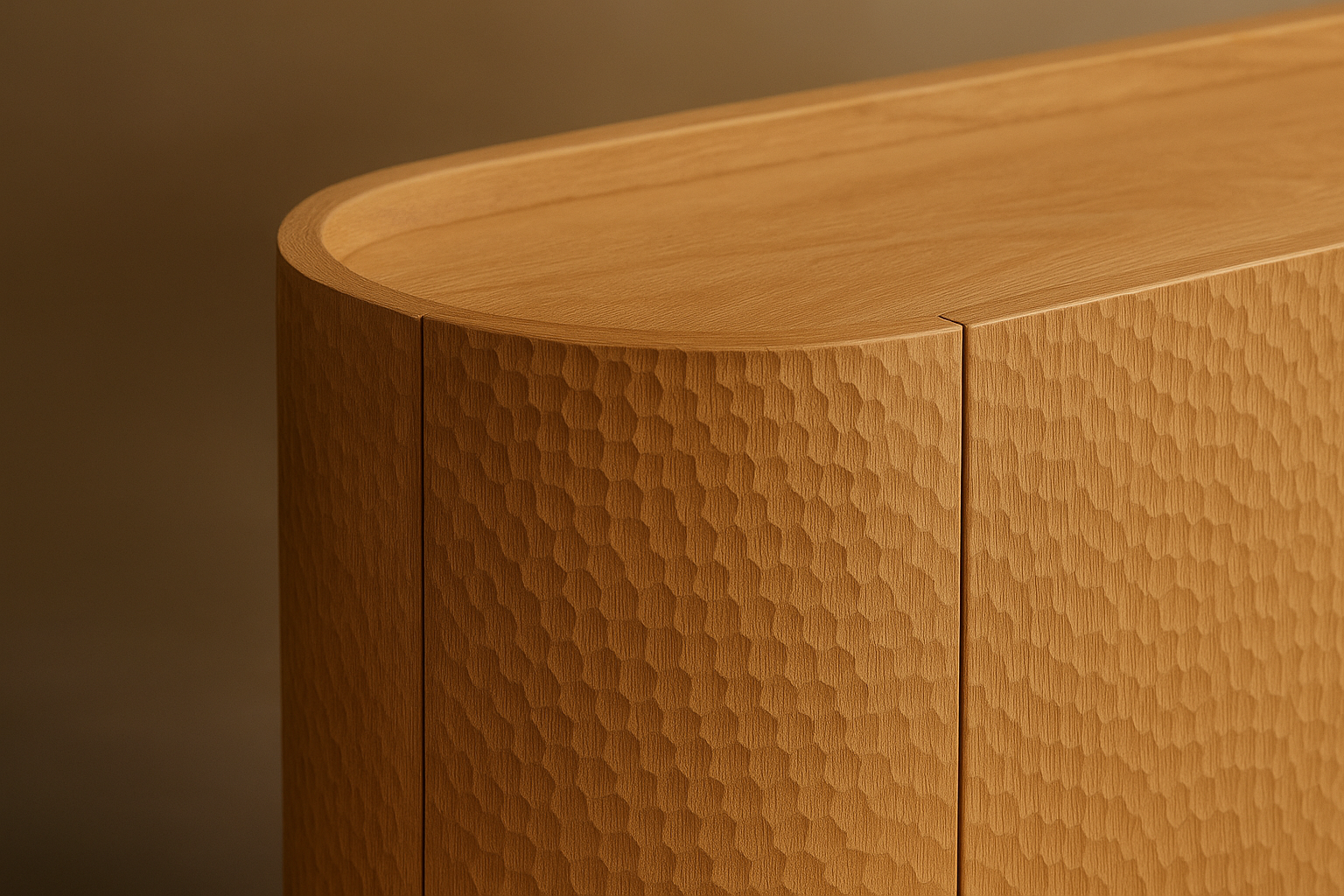
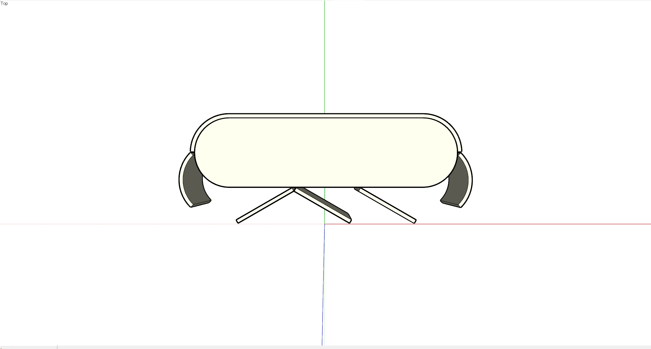
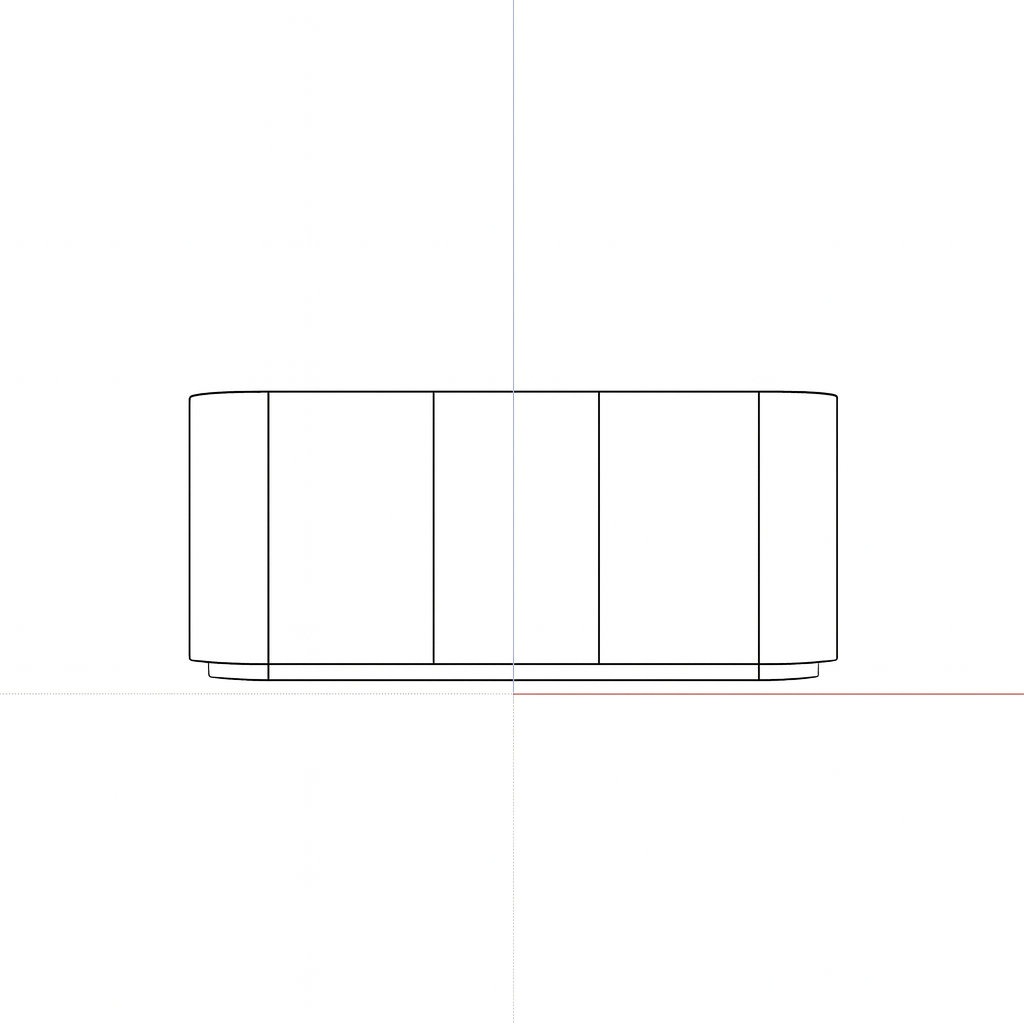
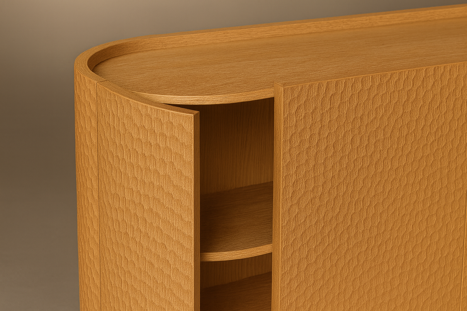
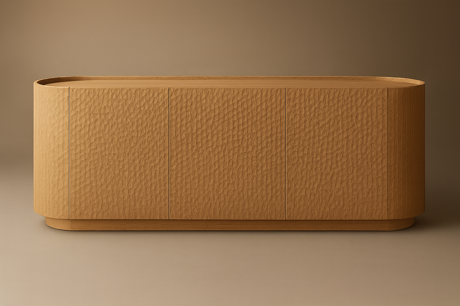
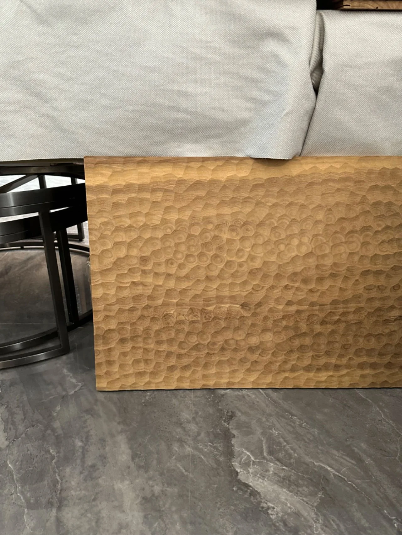
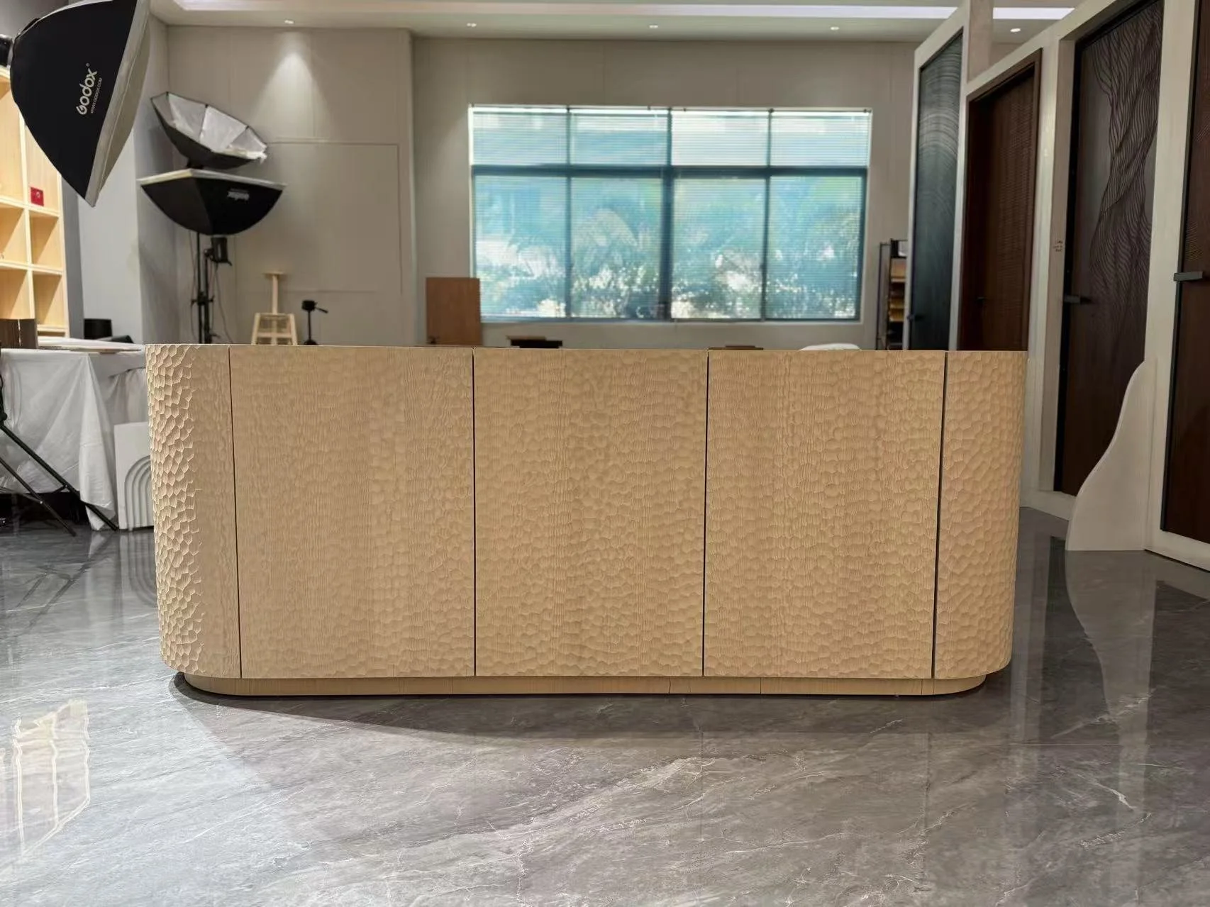
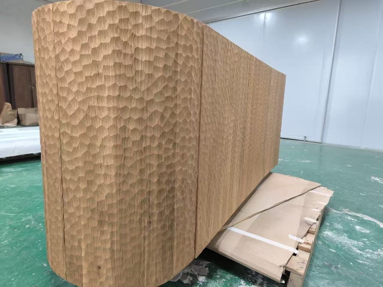
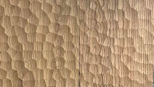
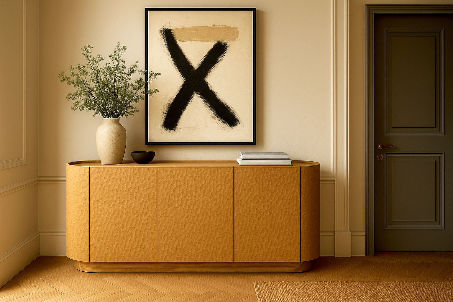
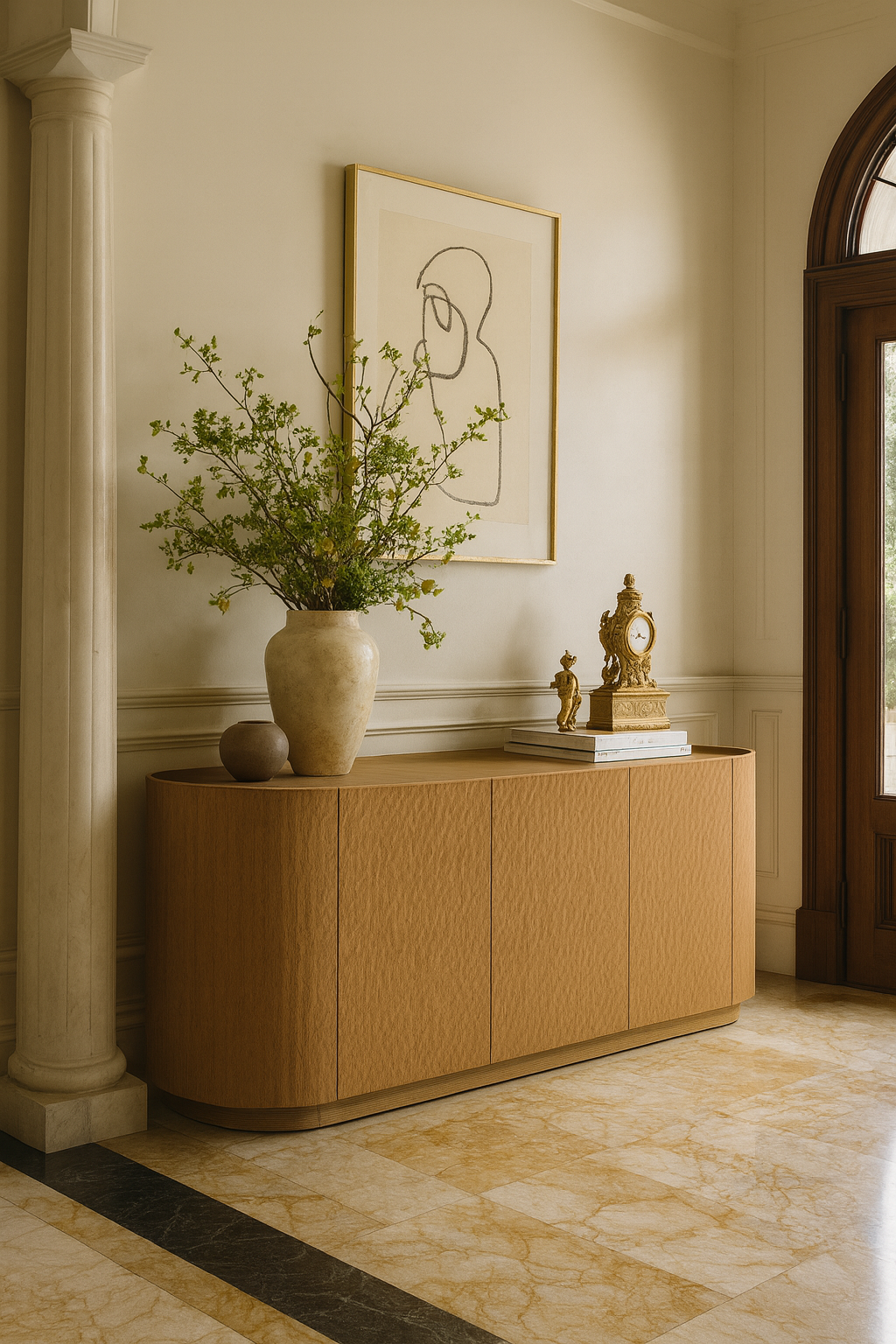
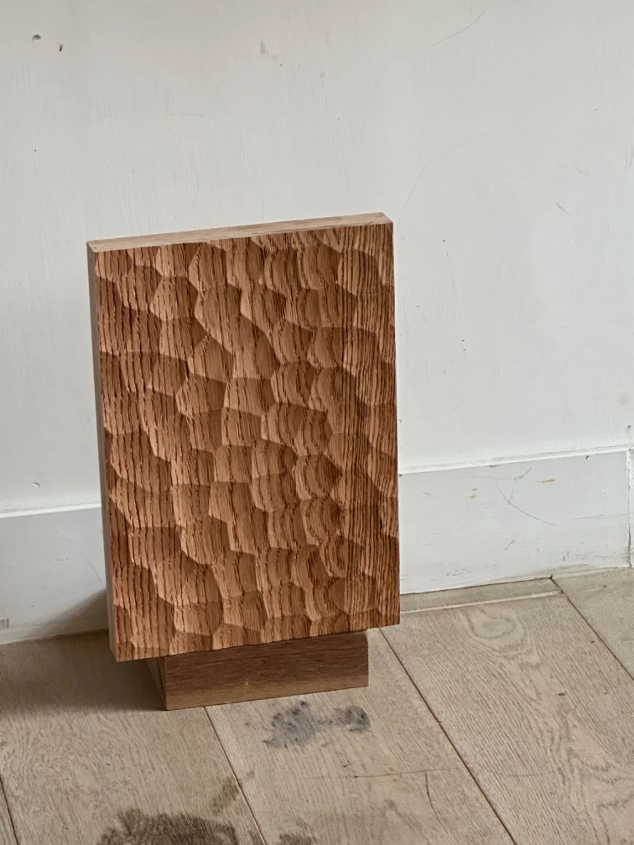
Instead of starting with style, we started with proportion and use. The silhouette emerged first: a softened, pill-shaped volume that felt grounded and calm rather than sharp or architectural. Plain-sawn white oak became the base material—warm, legible, and capable of carrying texture without feeling decorative.
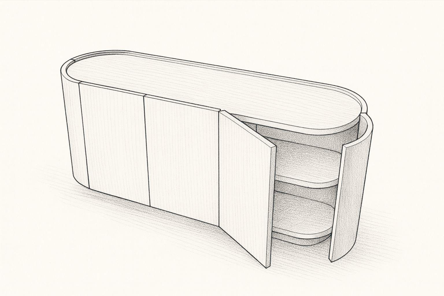
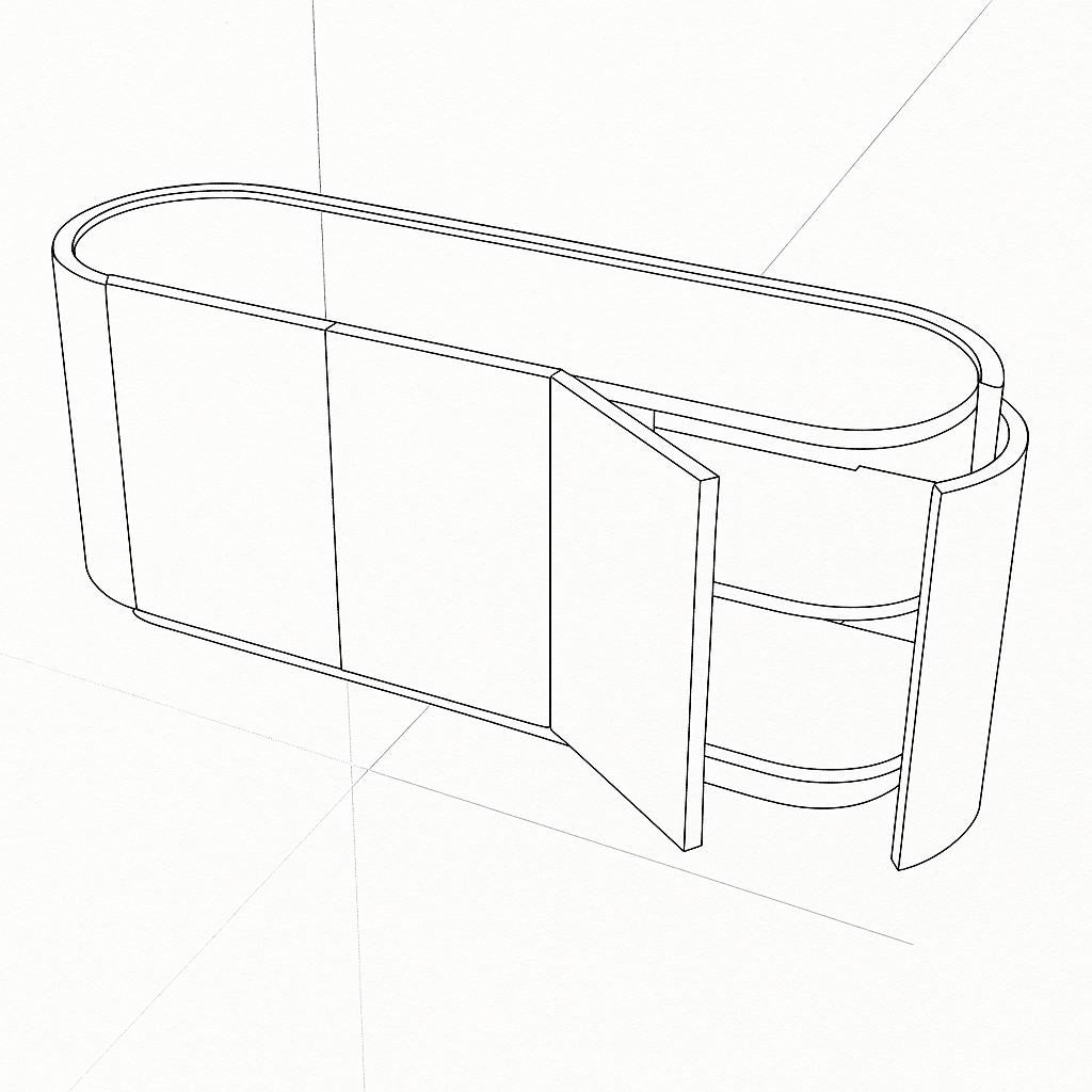
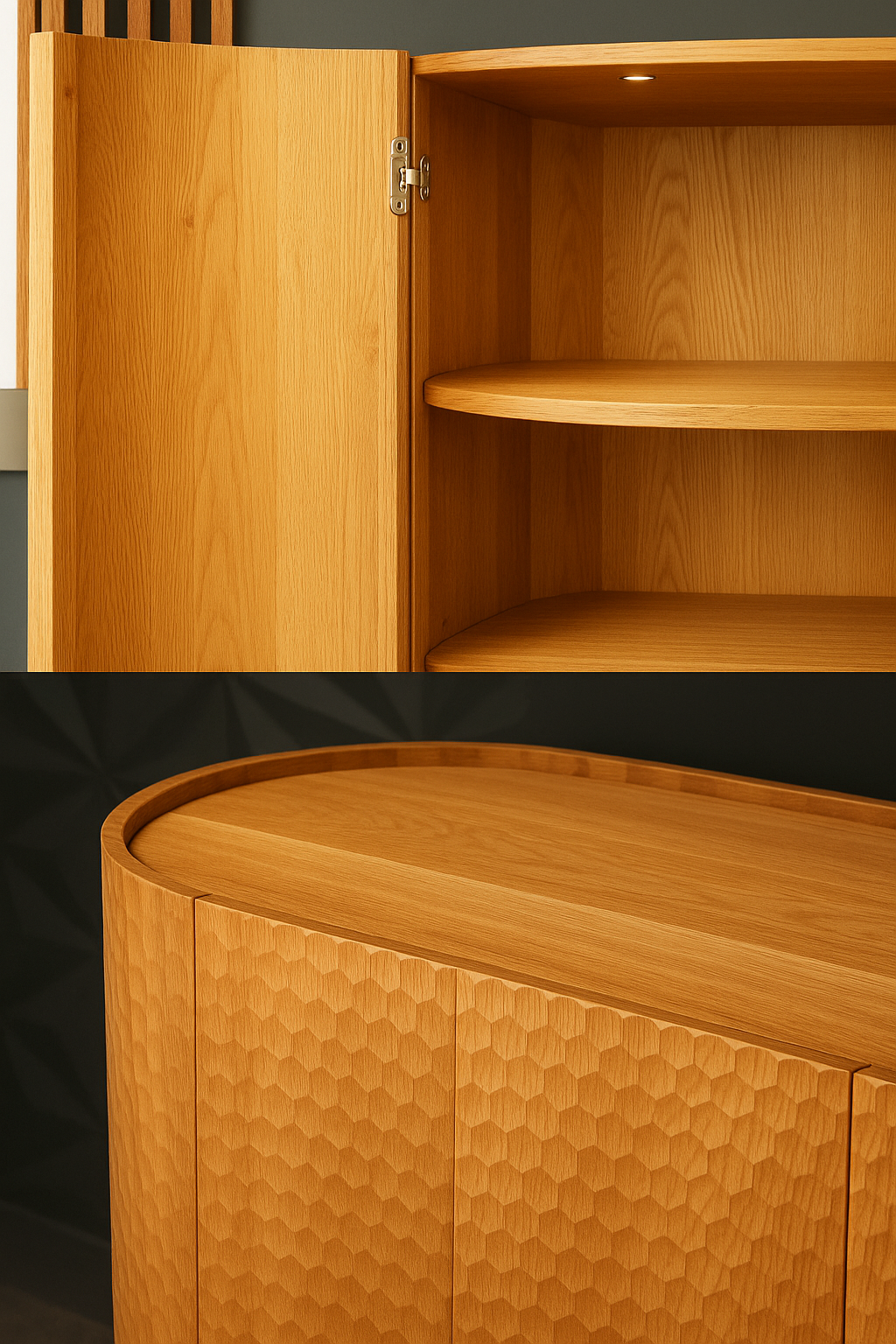
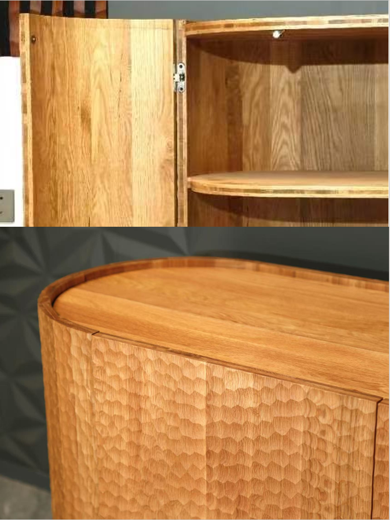
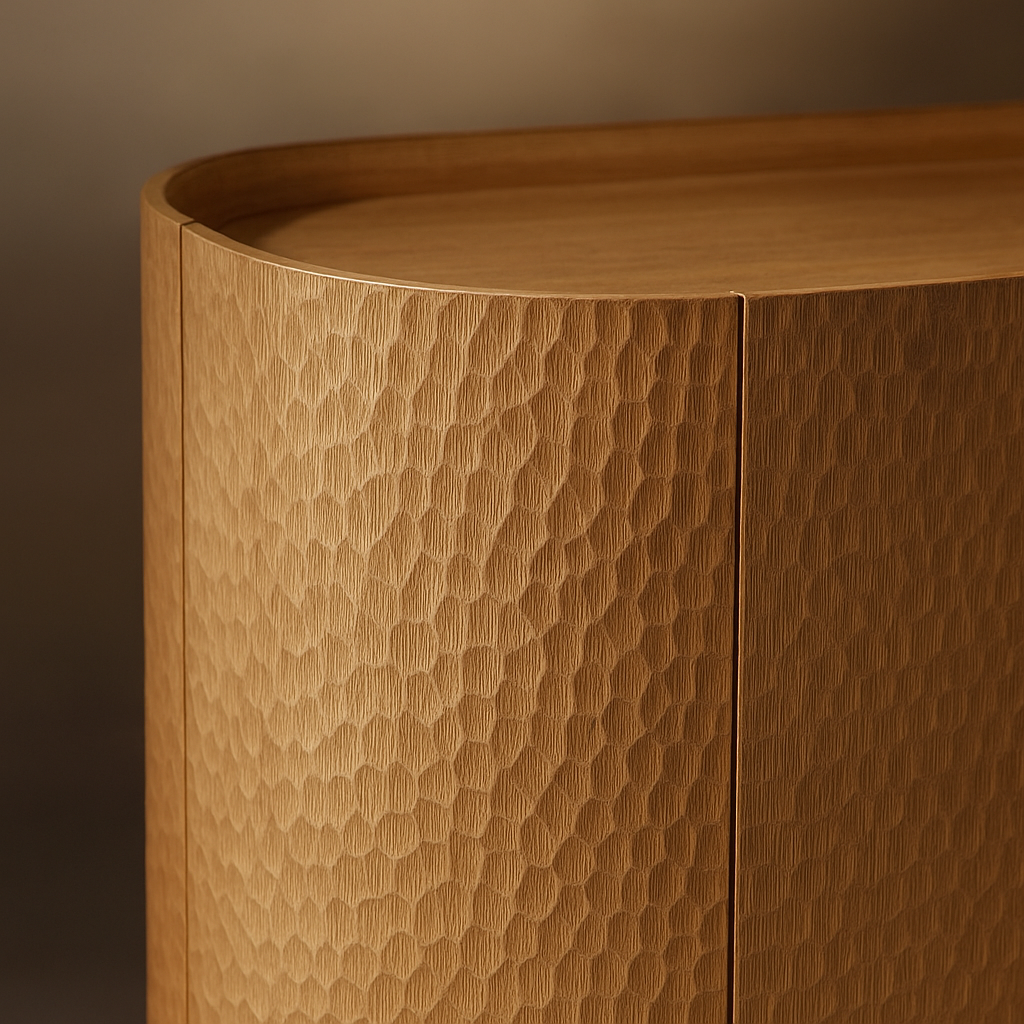
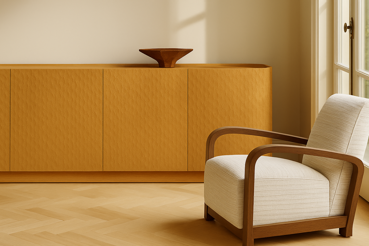
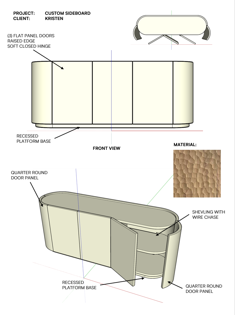
The gouged surface pattern followed. Referencing the quiet tactility of Jean-Michel Frank, the texture was designed to catch light subtly, changing throughout the day without demanding attention. A .-inch raised surround wrapped the top like a racetrack—providing both a visual frame and a clean, hardware-free way to open the doors.
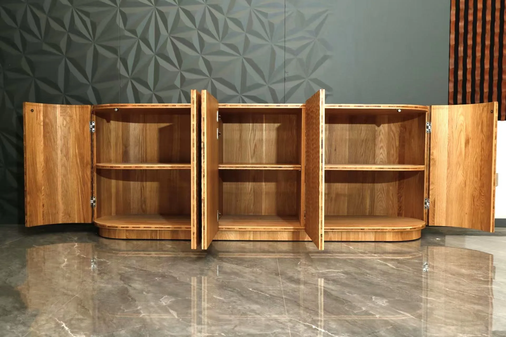
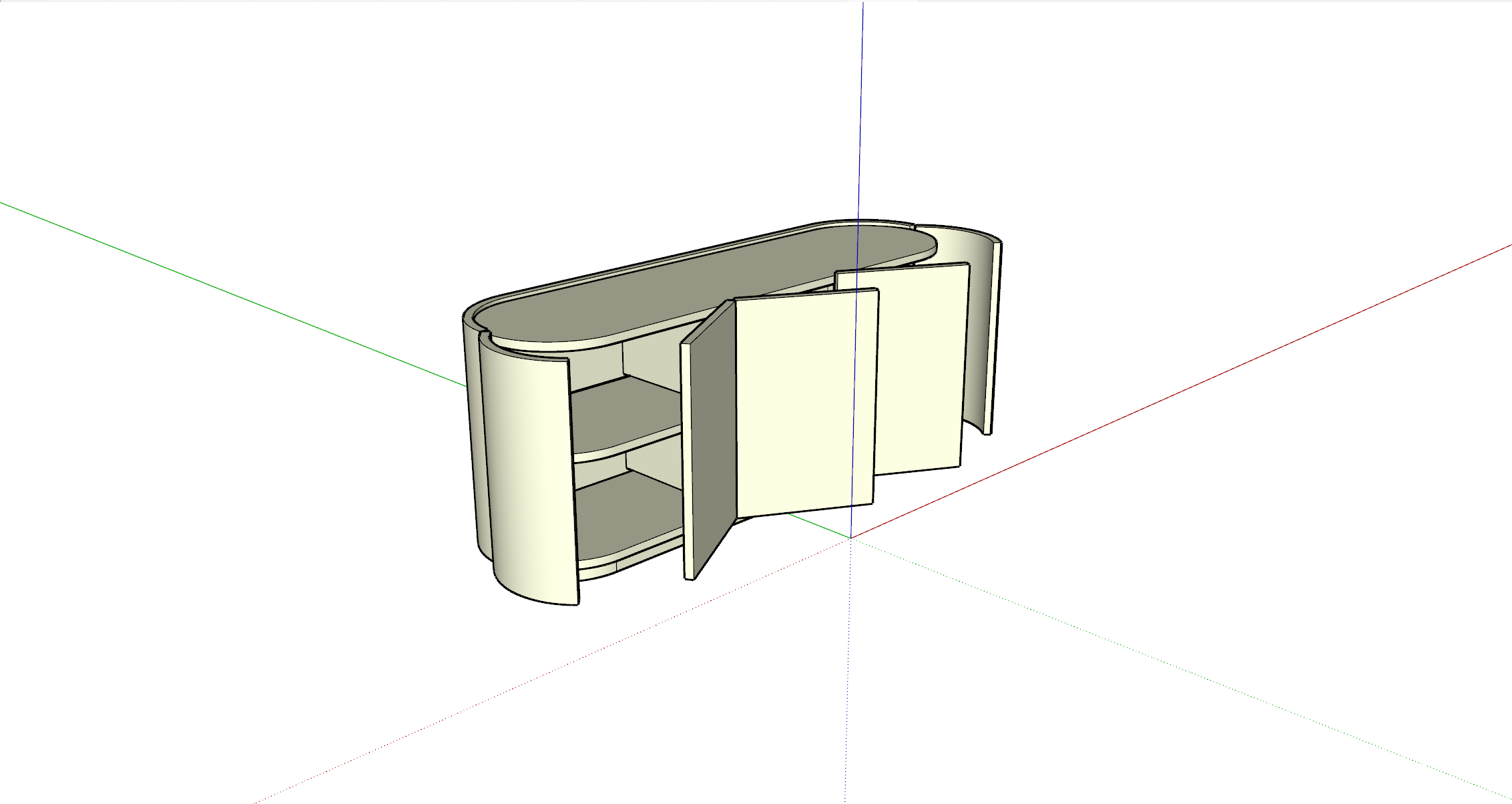
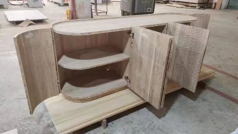
When the client reviewed the initial 3D model, she flagged something important: corner access felt tight. That single moment reshaped the entire piece. Quarter-round doors were introduced at both ends—transforming what could have been dead zones into fully usable storage. Not complicated. Just considered.
THE JOURNEY
Details We Refused To Rush
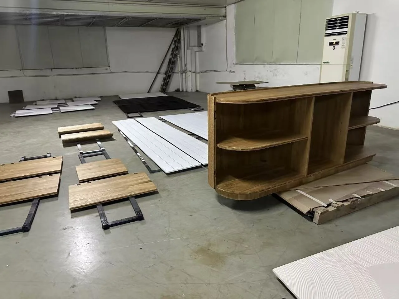
This was not a simple build. White oak behaves beautifully—until it doesn’t. To prevent warping and cracking over time, solid oak boards were sandwiched with a plywood core, balancing stability with visual integrity. The gouged texture was rendered using modern machining to control depth and rhythm, then hand-finished to restore warmth and variation.
The quarter-round doors required extensive testing. Their curved mass introduced weight challenges that flat panels don’t. Multiple hinge configurations were prototyped, reinforced, and retested until the swing felt eMortless and the load was properly supported. Interior shelving was rounded to echo the exterior form and reinforced to increase weight capacity.
A concealed wire chase runs discreetly along the back, exiting through the recessed platform base—allowing power and electronics to disappear entirely. Nothing accidental here. Designed once. Lived with daily.

THE RESOLUTION
Where It Landed
The finished piece is quietly bold. Sculptural enough to stand alone, calm enough to live with. It anchors a room without dominating it and works just as comfortably against a wall as it would floating as a low divider.
While the final installation was postponed due to the client’s relocation, the cabinet stands as a clear portrait of its owner—modern, grounded, and self-assured. It hides what needs hiding, highlights what deserves attention, and never asks for more than it gives.
This wasn’t about filling a space. It was about marking a shift. Furniture as identity, expressed through restraint. Subtle, by design.